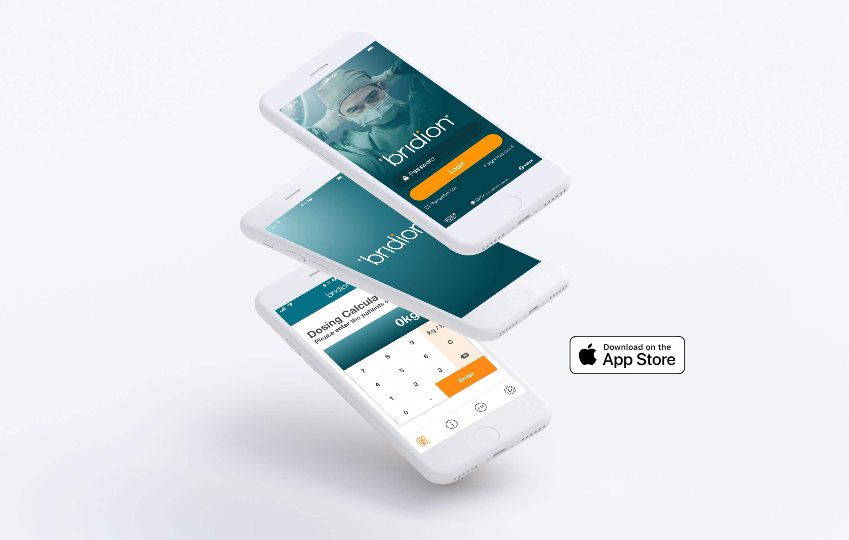
Bridion Dosing APP
The Bridion App provides up-to-date resources and dosing information for Canadian Health Care Professionals (HCPs).
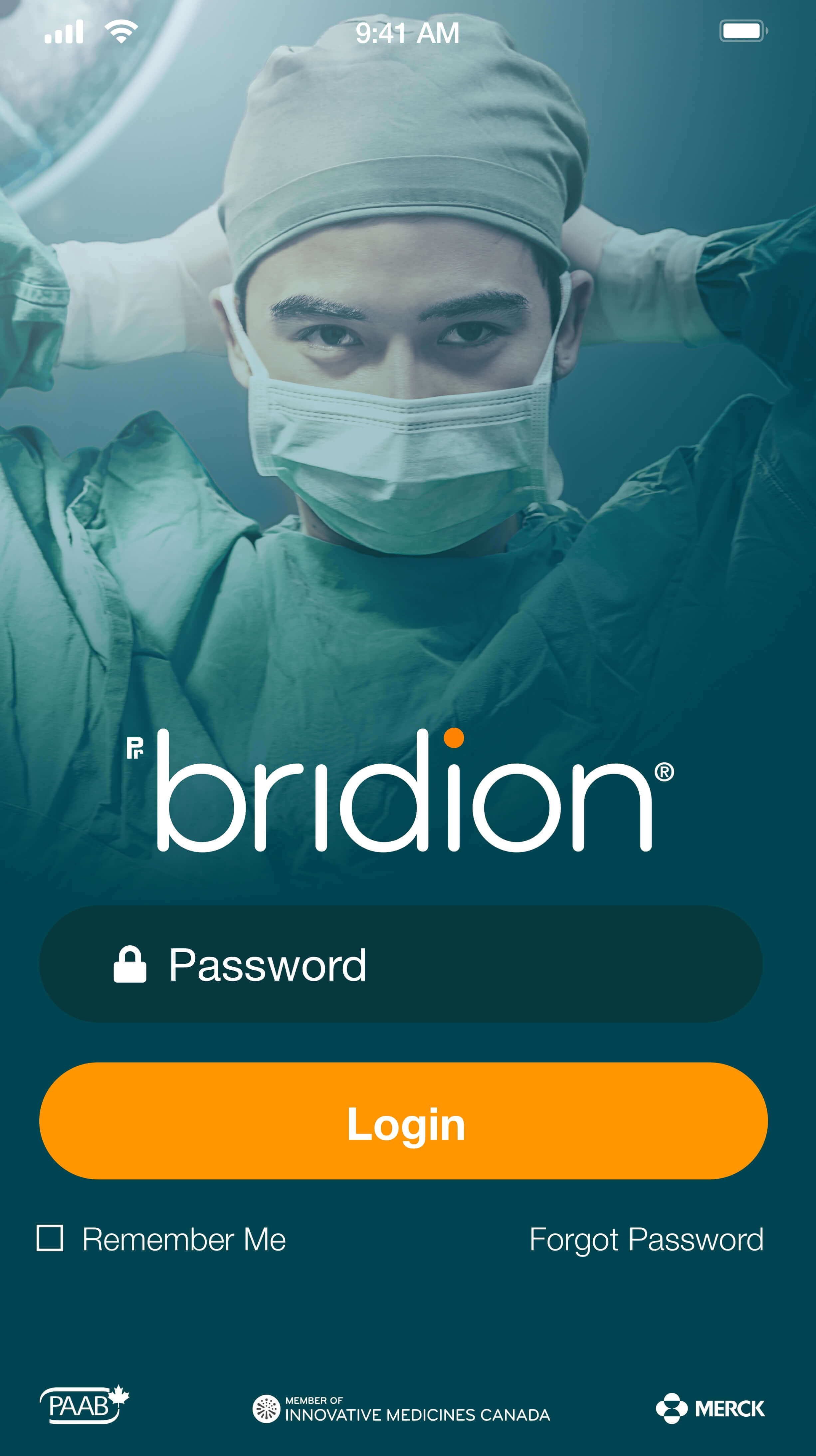
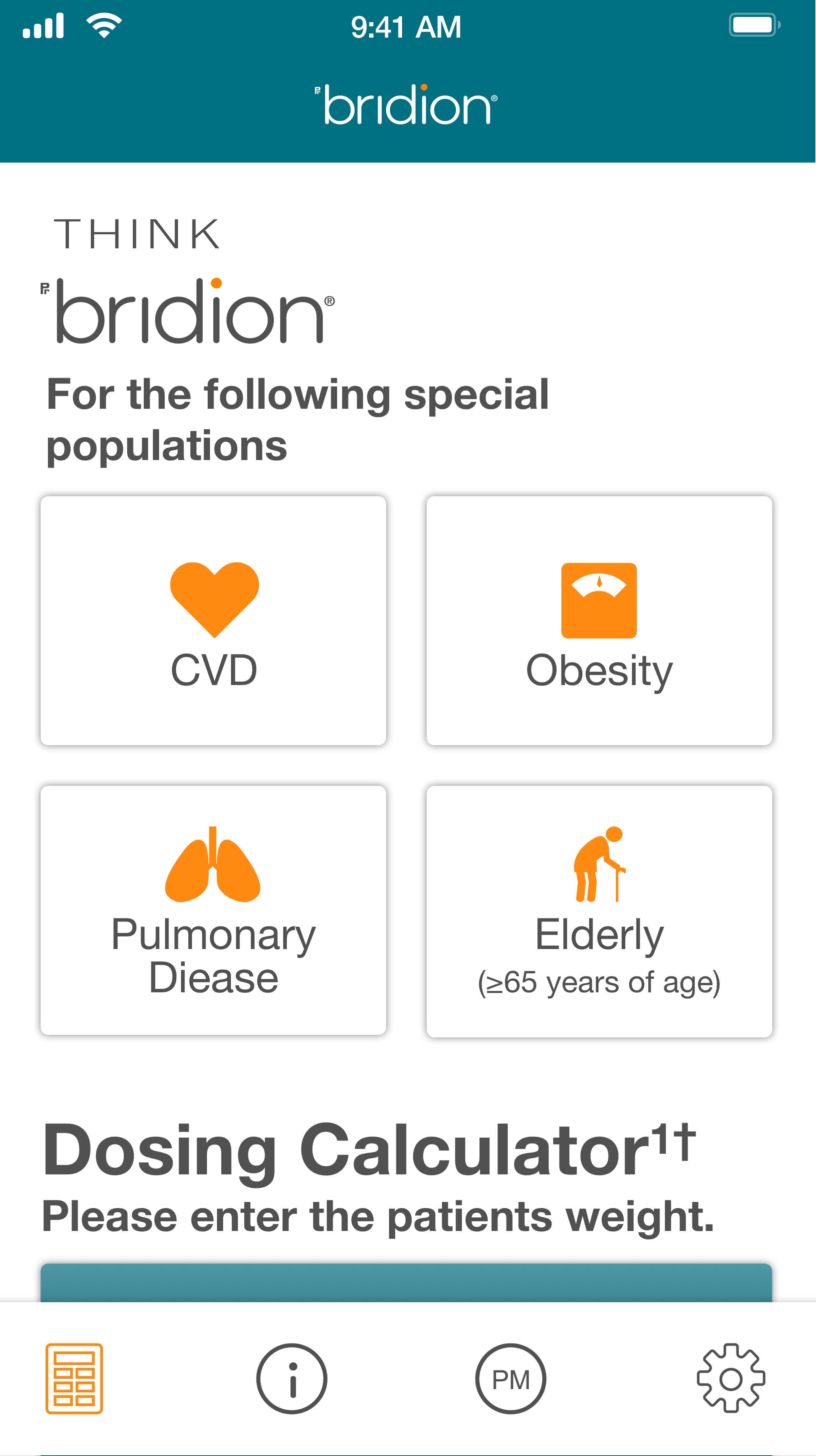
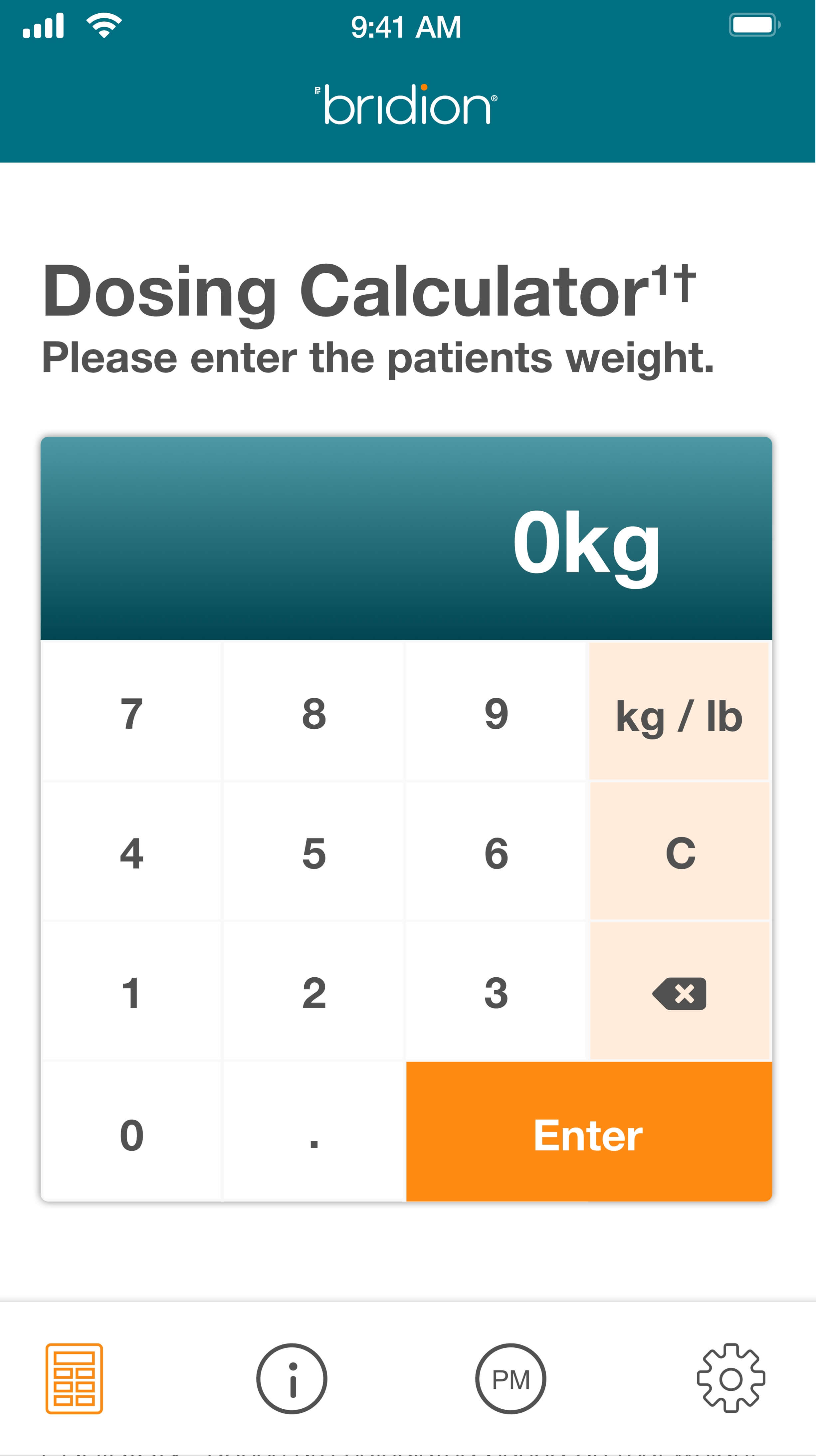
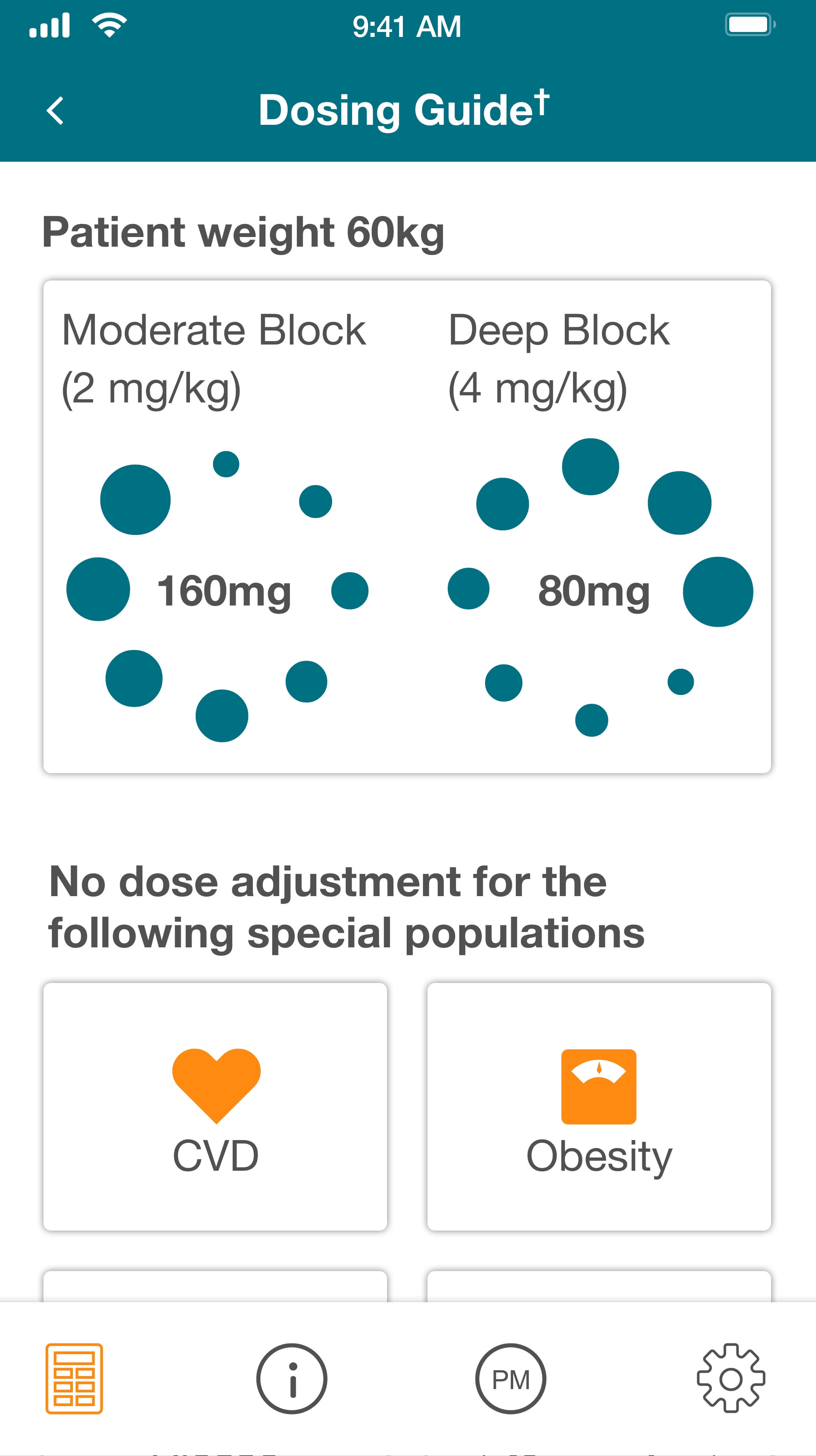
With an emphasis on user-centered design, we took into consideration the user, the goals, and their environment to create a UX design that would easily allow HCPs to quickly calculate different doses based on the patient information. We then used micro animations and clean UI elements to generate the results in a clear and focused way. Working off a logo, we created a brand tone through colours, language, and images that have been applied to digital and print materials across Canada.
Client Merck Canada | Bridion Role UI/UX Designer | Art Director Year 2020 APP Available in the Apple Store
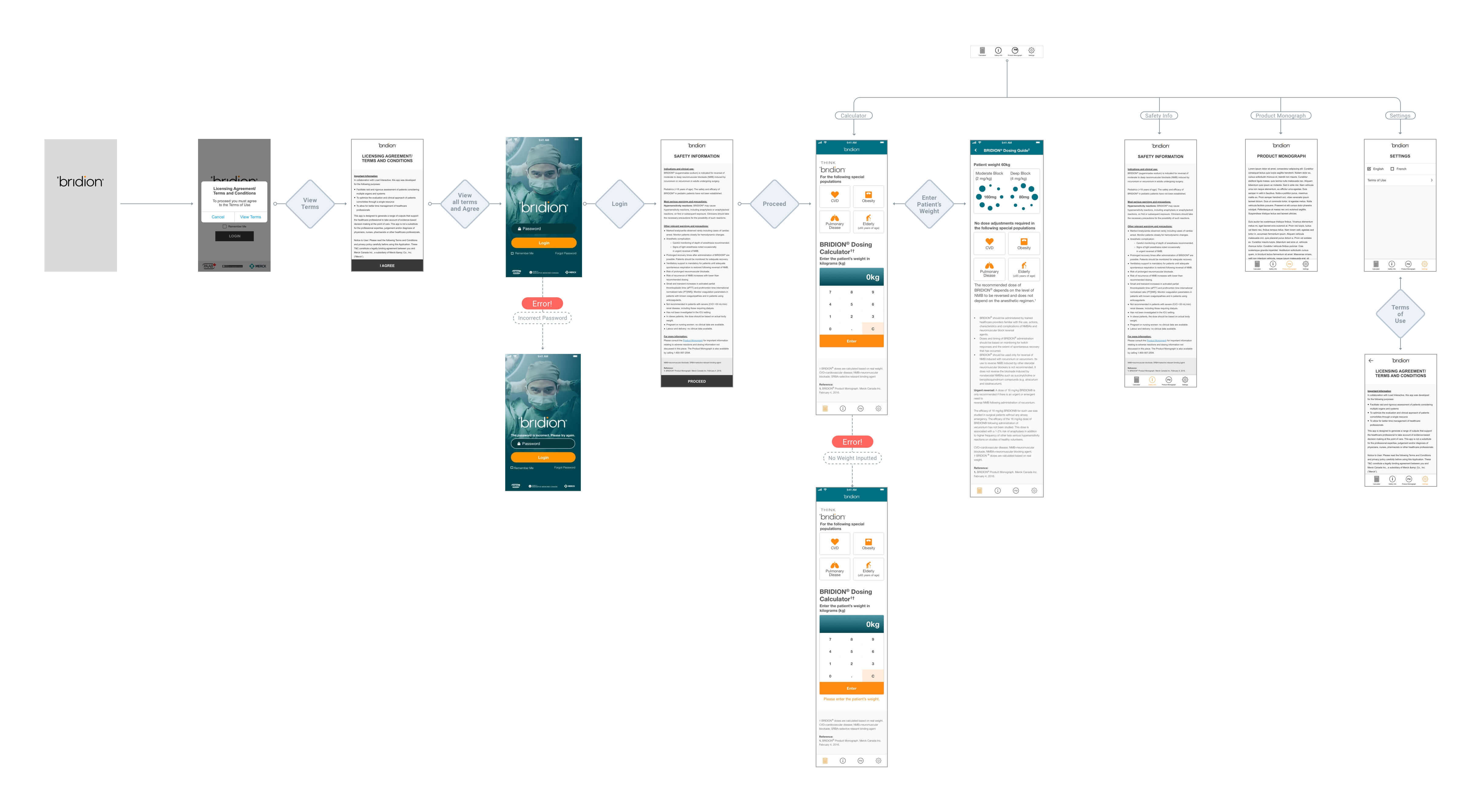
Userflow
UI Design


Designed and Developed with by Landa Thomas